My Portrait Collage Poster Series (2012-2021)

In 2011, I was recently divorced and needing an ambitious creative project to sink my teeth into during the bleak New England winter. I have a life long appreciation of quotations and decided to make a poster featuring quotes paired with portraits of notable people. Unfortunately, my project had a time limit on it - because I was entering it into a local annual art exhibition in the last week of January.

I decided to use Adobe Photoshop to create my portrait collages, as the digital art program would allow me to effectively manage my visual assets, while allowing me to make design changes more quickly. My intent was to use Photoshop in a minimal way, avoiding most of the digital tools available in the software, yet enabling me to reduce elements to simple shapes, cropped and/or tinted different colors. After weeks working late into the night, I created a 20”x36" poster with 20 portraits of people who played an important role in the 20th century. A quote attributed to each person was displayed beneath their portrait. At the time, I figured this would be a stand-alone art project. The first portrait I completed was of Albert Einstein.

This is the first displayed version of this poster. I would later add 5 more portraits to the poster and that was the format used in the subsequent posters.

This is the first displayed version of this poster. I would later add 5 more portraits to the poster and that was the format used in the subsequent posters.

The art show, which had well over 100 hundred participants, was on display for two weeks. Because I missed the opening night reception, I never had an opportunity to see how my project was received. When I finally went to reclaim my poster 2 weeks later, there were two older women looking at it very earnestly. One was kneeling and reading the glossary of attributions at the bottom of it. After informing them that I was picking up my art, the woman on her knees said, "So you're the artist? This is wonderful! You should make another poster about religion." In that moment, I knew that I had stumbled upon an art project that might engage me for a while.

Since that fateful meeting in 2012, I have made hundreds of portrait collages, and each poster has a unifying topic, linking all of the featured people. Each comprises 25 portraits, like the original poster, and has a quote paired with a collage. I selected significant quotations related to the theme of the poster.
The posters were produced in this order:

20th Century Visionaries (2012)

This is the final redesigned poster, completed after it’s initial design. It has 5 more portraits than the the first poster. this is the format that all the later posters would adhere to.

This is the final redesigned poster, completed after it’s initial design. It has 5 more portraits than the the first poster. this is the format that all the later posters would adhere to.

Faith & Spirituality (2013)

Faith and Spirituality Poster.jpg

Love & Sex (2014)

Love and Sex Poster.jpg

Food & Wine (2015)

Food and Wine-Poster.jpg

Freedom & Equality (2016)

Writers & Directors (2017)

Science & Innovation (2018)

Science & Invention_Low Res.jpg

Exploration & Discovery (2019)

Exploration and Discovery Poster.jpg

Reading & Writing (2020)

Reading-&-Writing-Quote-Poster_Web.jpg

Artists & Art (2021)

Artists-&-Art-Quote-Poster_Web.jpg

A Film Tour of Scotland

I’ve been a life-long movie buff.  It’s safe to say my love of film is a genetic thing. According to family mythology, my twin brother Mark and I attended the film Tom Jones in utero. As teenagers, we both worked our way through high school and college employed at a memorable New York City movie memorabilia shop; Jerry Ohlinger’s Movie Move Store. We grew up watching old movies on television,at the library and even 16mm bootlegs of classic films.
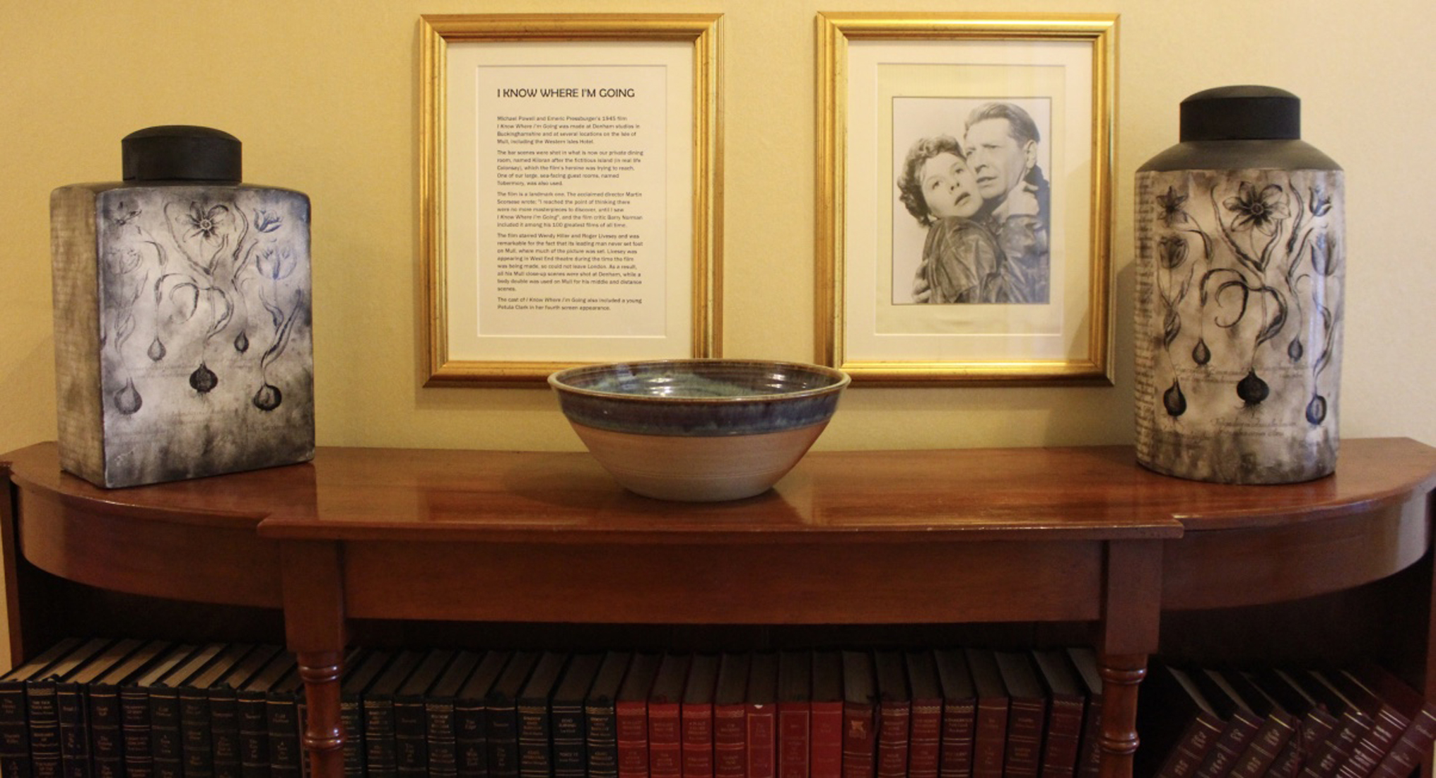
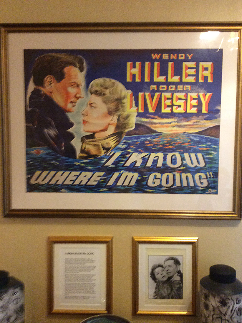
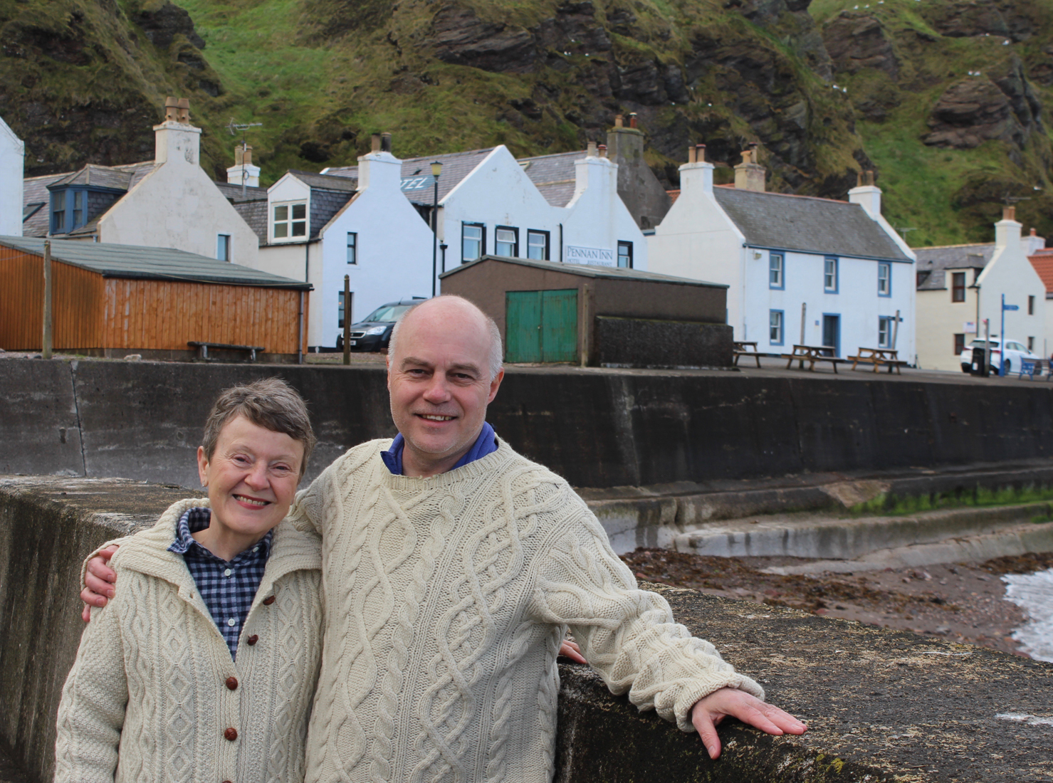
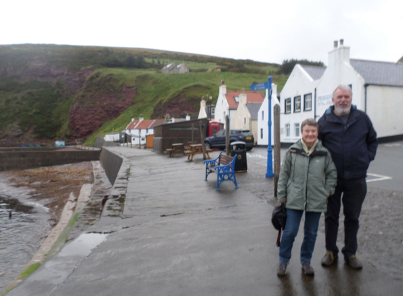
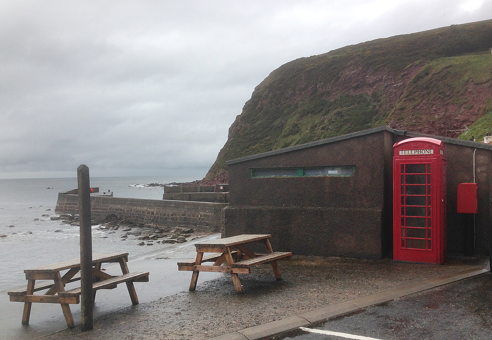
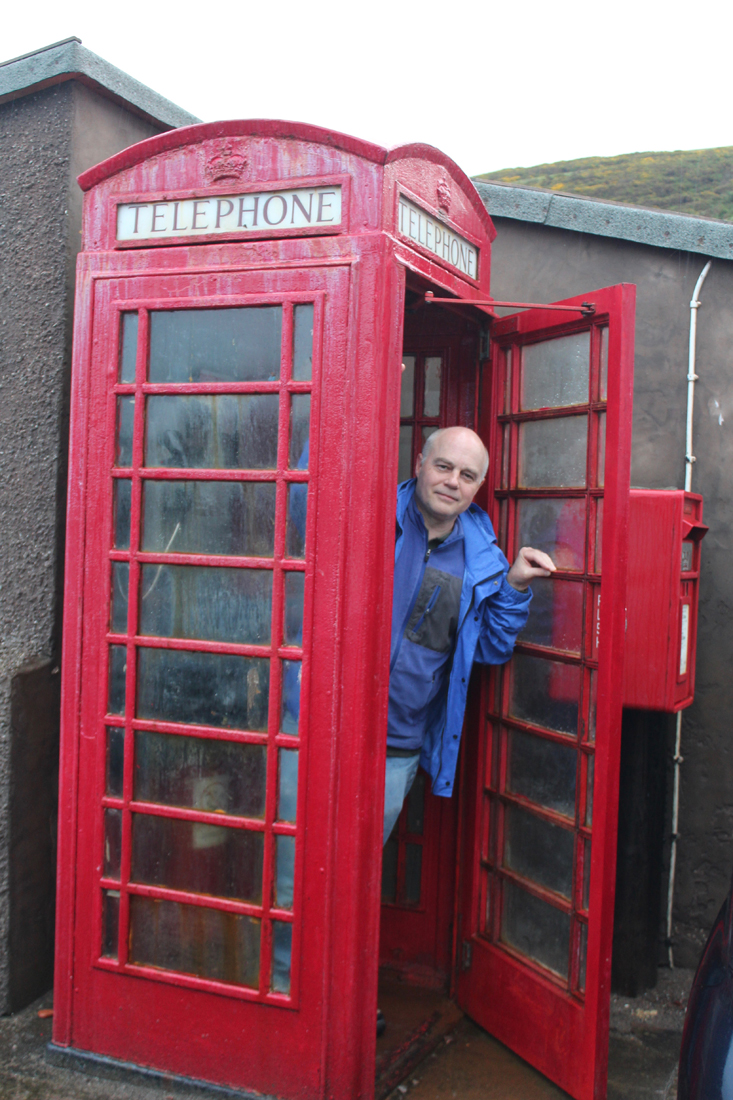
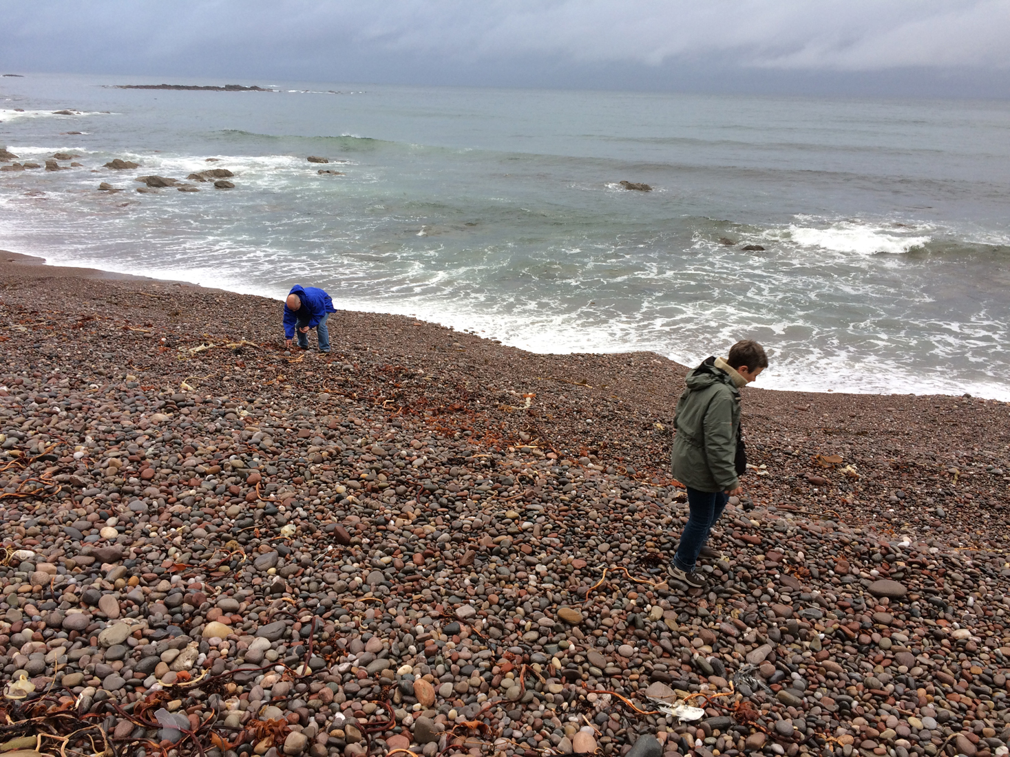
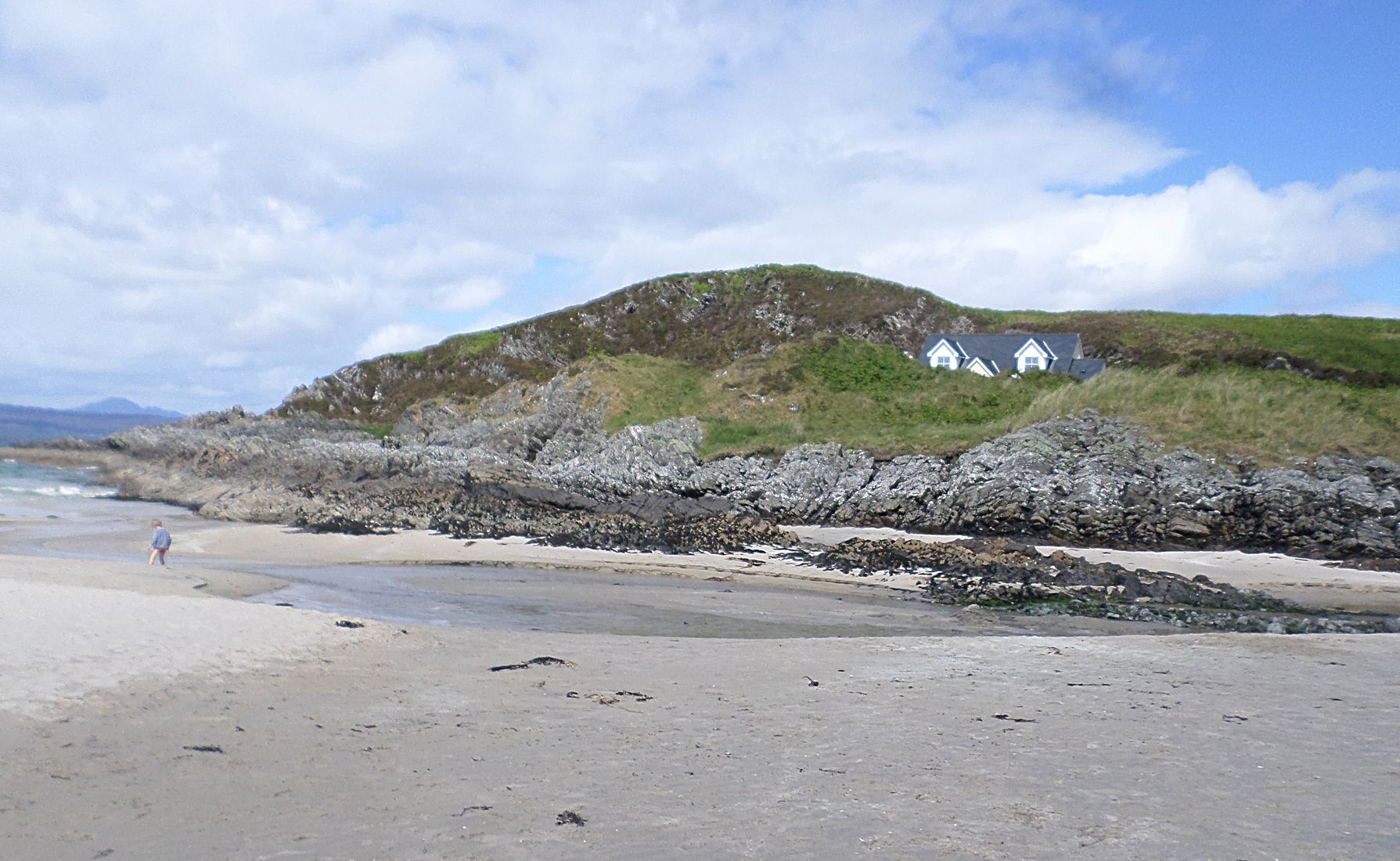
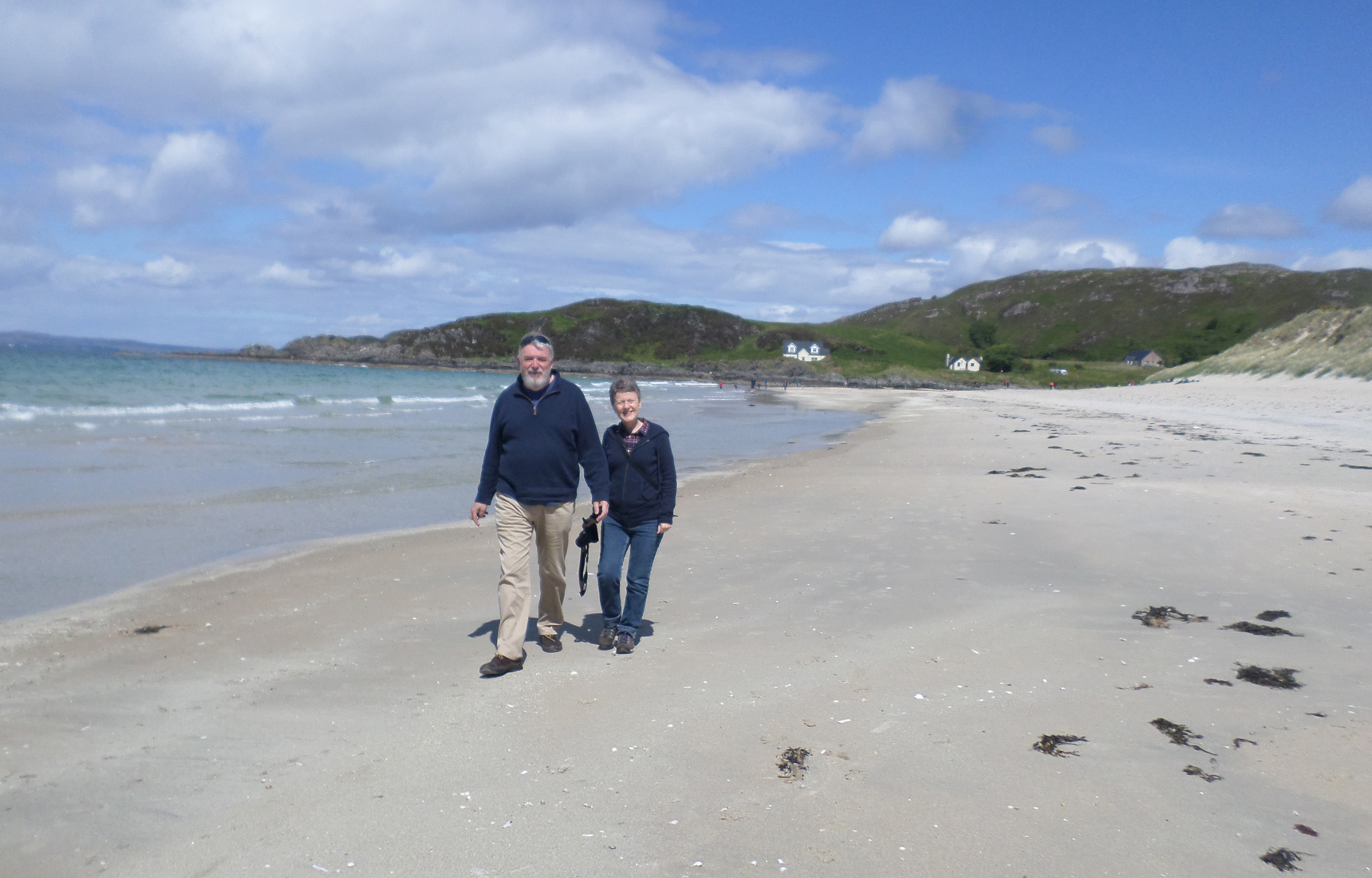
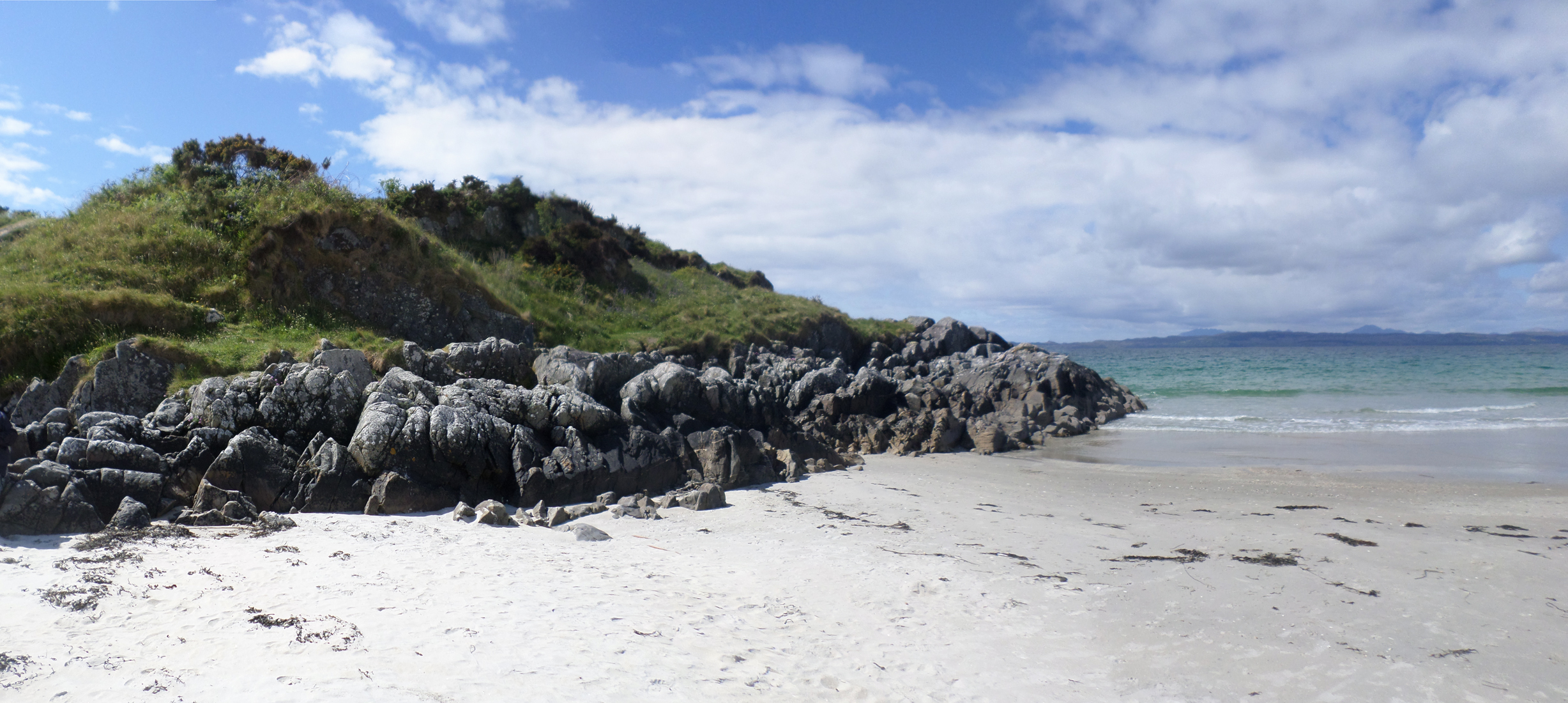
This past summer, my cousin Elaine and her husband Rob decided to take me on a road trip through Scotland, which would intersect with two of our mutually favorite films: I Know Where I’m Going and Local Hero. We only had a week to accomplish the journey, but Elaine plotted and researched the locations featured in these two films. The first two days of our trip took us up through Perth, and then to the hamlet of Pennan and town of Banff where scenes from Local Hero (directed and written by Bill Forsyth) were filmed. We also visited Camusdarach beach and several other Local Hero locations.
Click on the image to advance the slideshow.

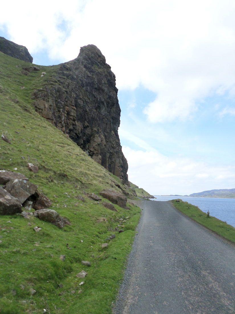
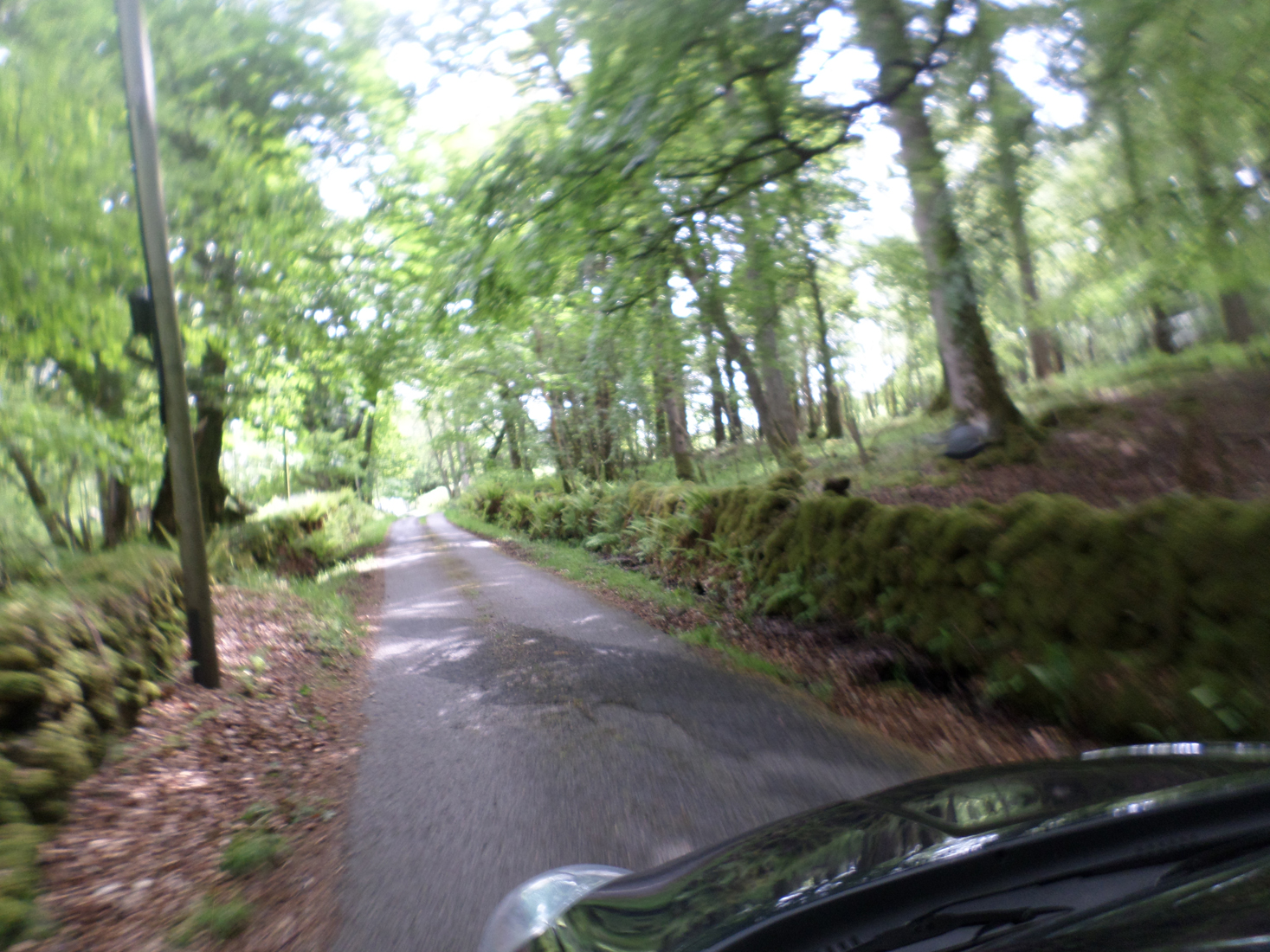
The other movie destination of the trip took us to the coastal port town of Oban and then the Isle of Mull, where Michael Powell’s wonderful film I Know Where I’m Going was shot. We stayed two nights in a guest house in Oban, so that we could take the ferry out to Mull for our grand tour. The car ride about the Island was fairly extensive, given that we only had a single day to see whatever we could find.

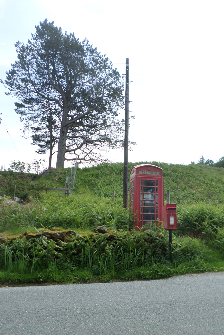
Thankfully, the weather was fantastic and we visited the town of Tobermory and several other locations from the film. One of the locations we wanted to see was the famous phone booth, which appeared in two scenes of the film. We never actually located the phone booth, but we had a memorable ride along the coast and through the middle of the island to the sounds of The Travelling Wilburys and The Stray Cats while searching for it.
Click on the image to advance the slideshow.


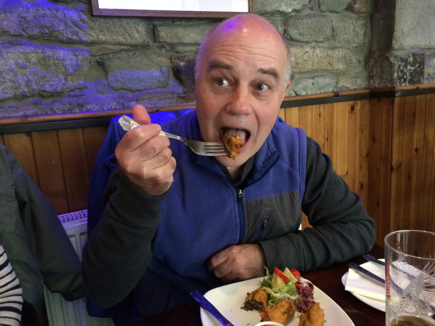
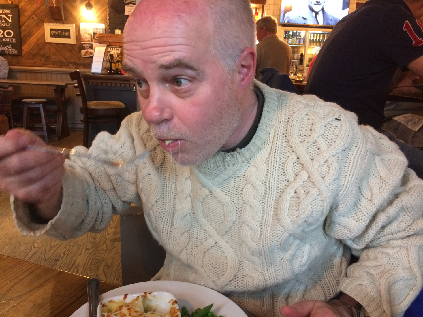
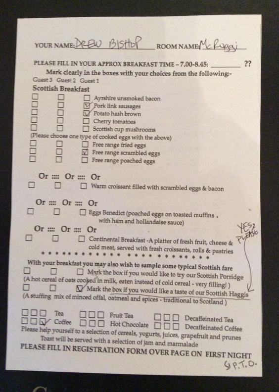
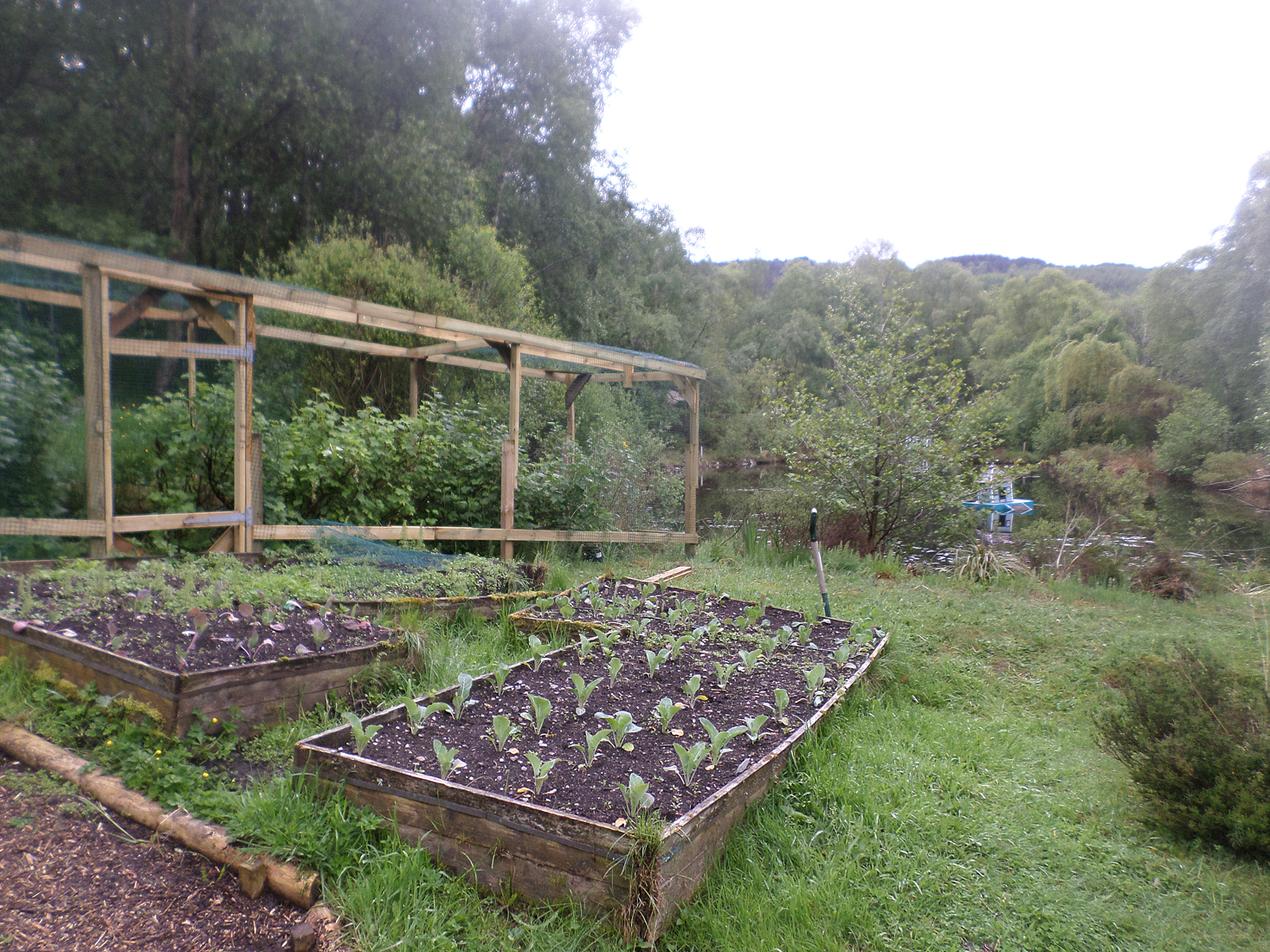
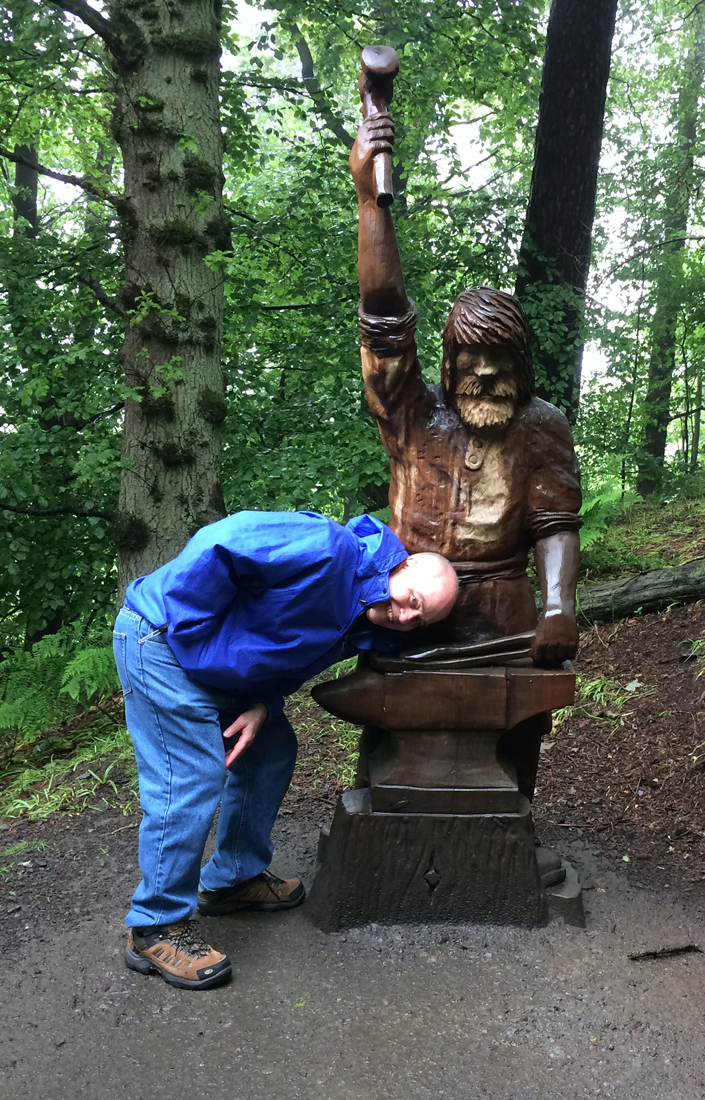
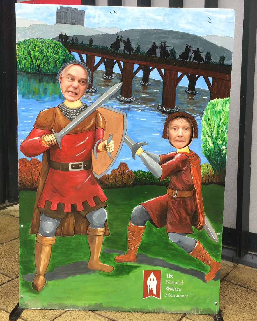
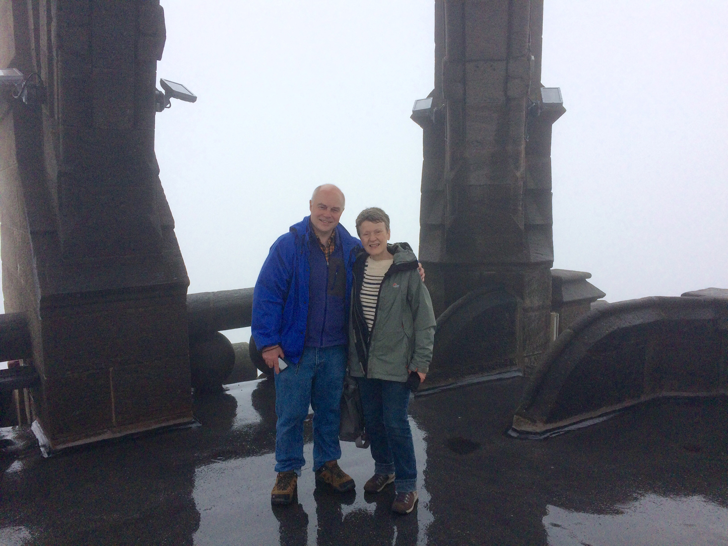
Our journey also took us through other historical sites, such as Loch Ness, Loch Lomond, the battlefield at Culloden and the city of Stirling, where William Wallace has a place in Scottish history. On my list of things I wanted to complete was to have the traditional Scottish dish haggis. As things would turn out, I had haggis presented in three separate ways: Indian deep fried in a crisp roll; a layered casserole with potatoes and turnips; and finally as a small side dish. In each case, it was delicious and not at all what some people had warned me about.
Here is an article about haggis and how it is being presented to tourists who have read or heard unfortunate things about Scotland’s national dish. https://www.saveur.com/eat-more-haggis/?src=SOC&dom=fb&fbclid=IwAR3SkkBTrO11gZZxrqXyf4Kk4Z-FUk4YYHGUeusS5WykZvSOD3Vo56Cqgbs

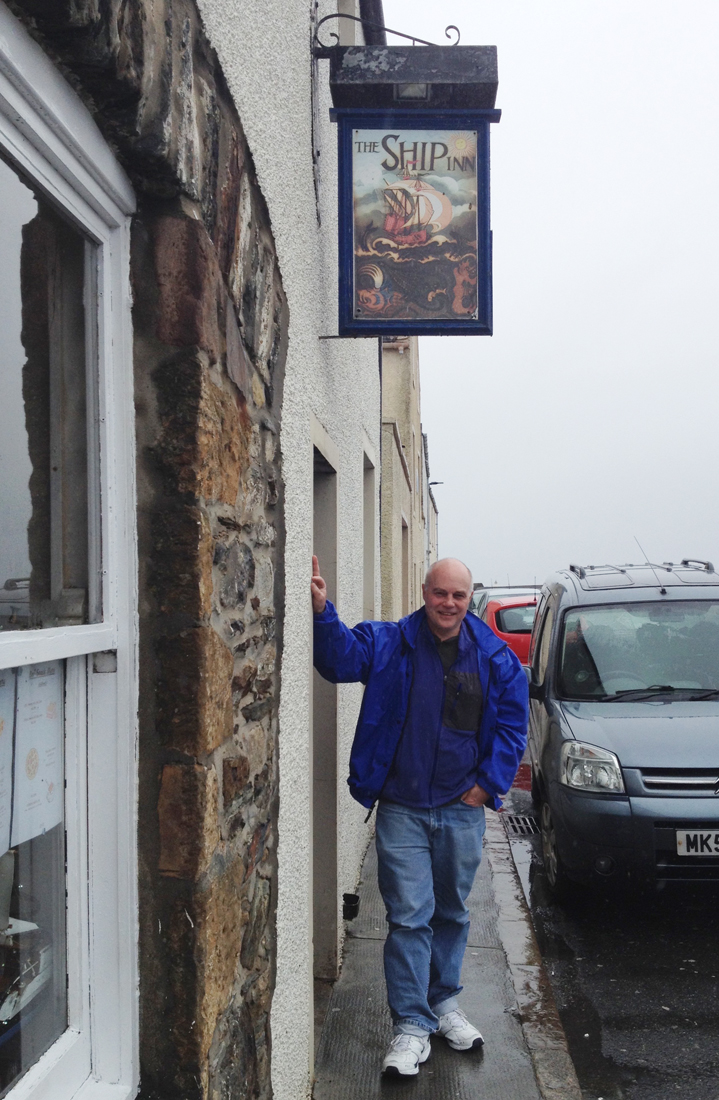
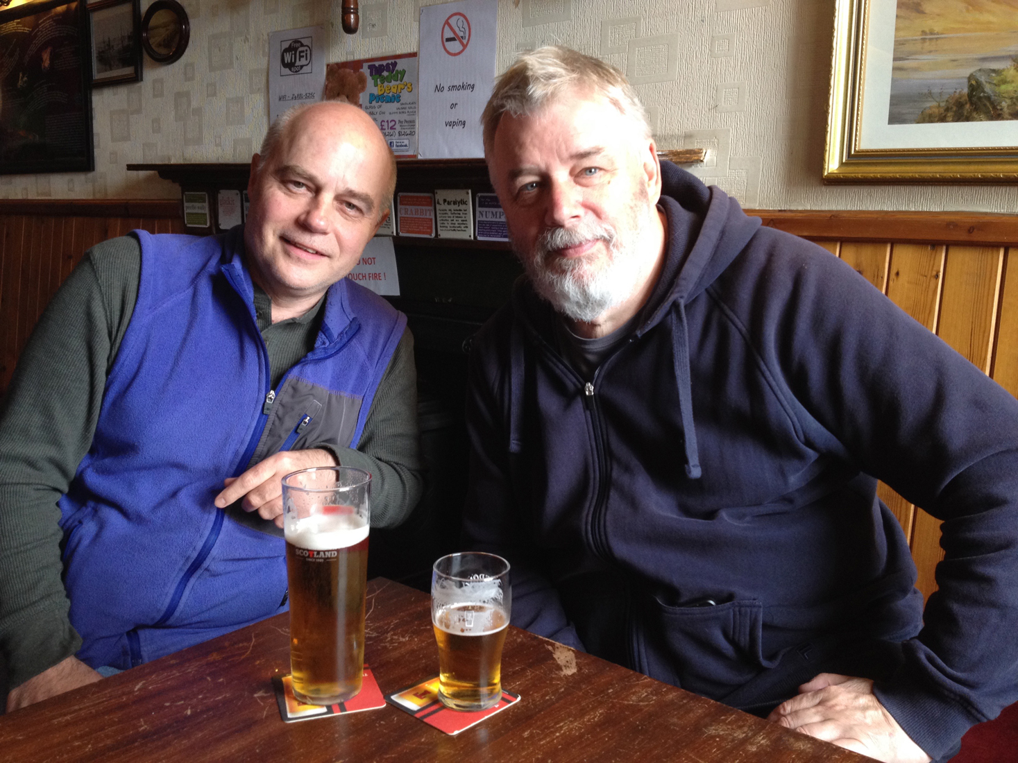
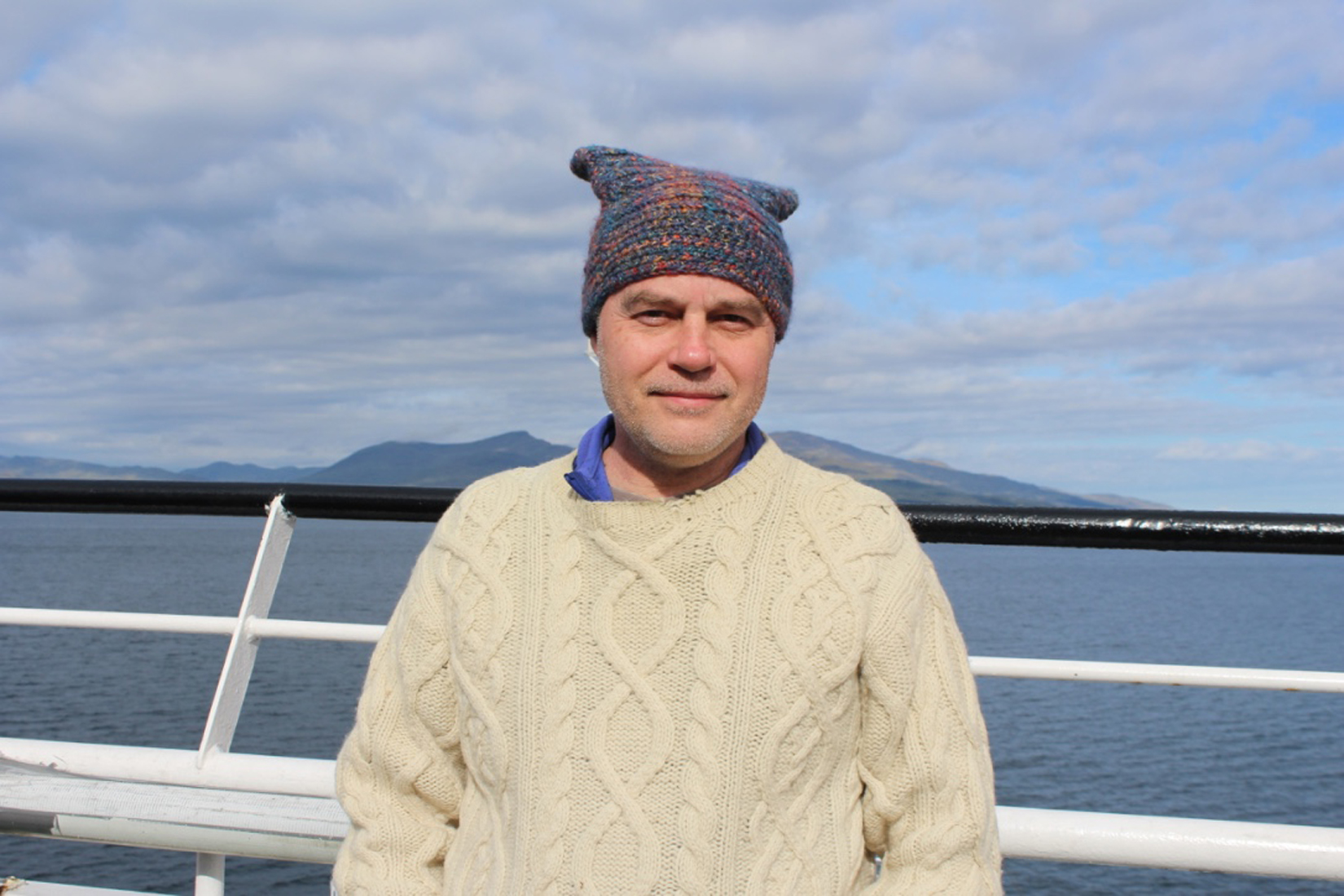
This trip was a once in a lifetime experience. Elaine and Rob did an incredible job of finding the film locations and  finding a route that took us on a circuitous journey with a different guest house or inn to end each day’s travels. We stayed in 5 different B&Bs or inns on our trip and had an afternoon or evening pint in every town we visited. Our innkeeper hosts were as memorable as the places they lived in.

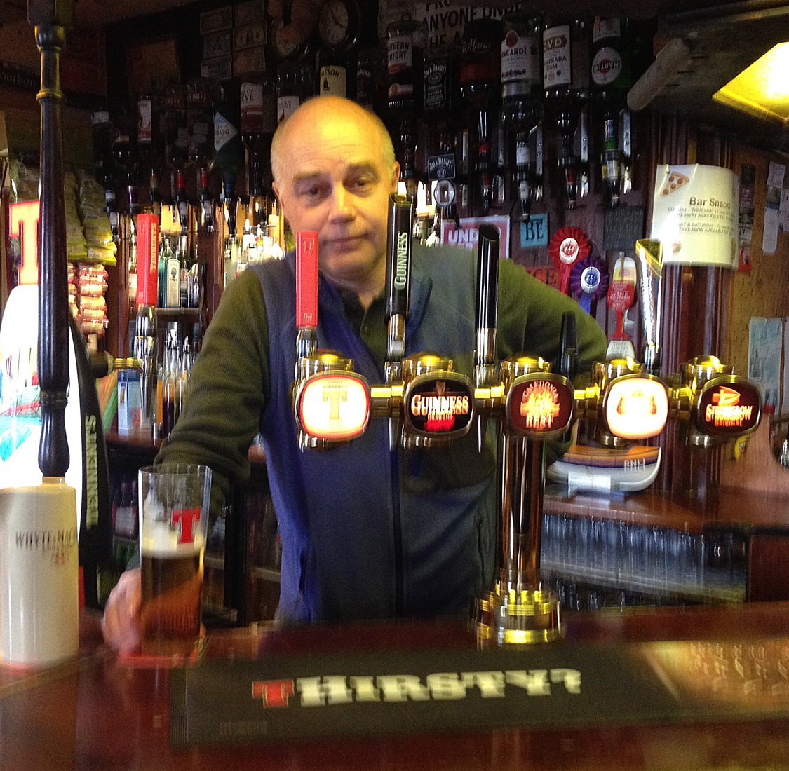
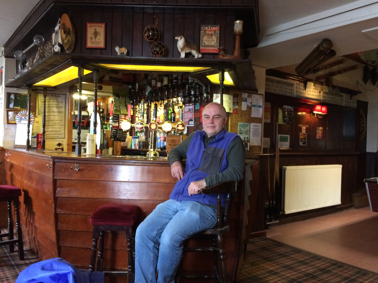
Susan Littlefaire, owner/operator of Woodlea in Perth, said she owned a B&B so that she could travel whenever she wanted. 
Click to advance slide show.

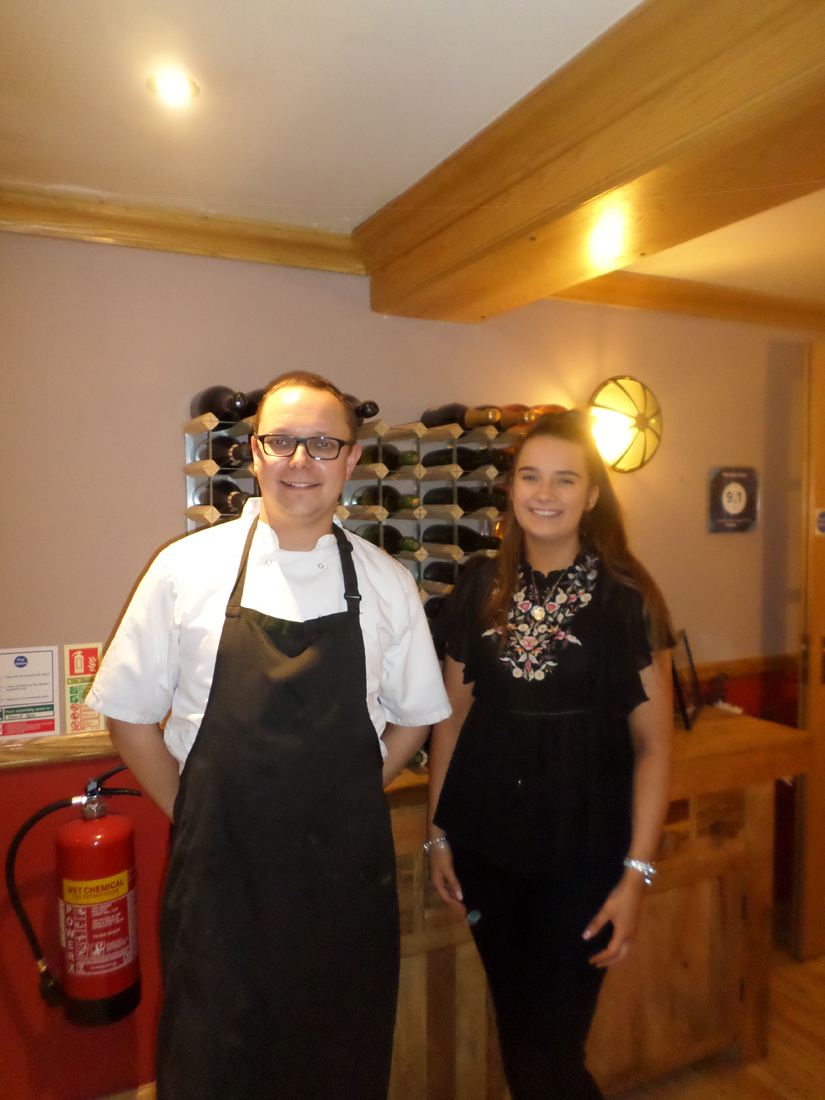
I learned that Peter Simpson,  the chef/owner of The Pennan Inn was well aware of its connection to Local Hero when he bought it. The tiny inn had changed ownership several times in recent years.
Click on the image to advance the slideshow.

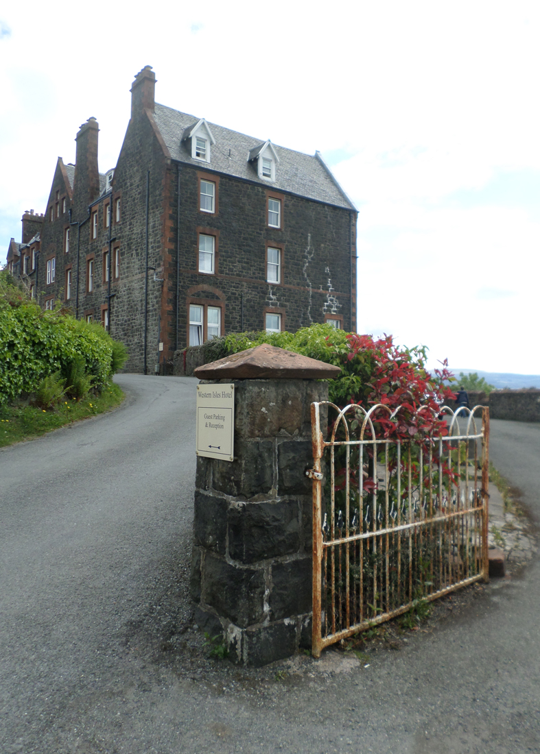
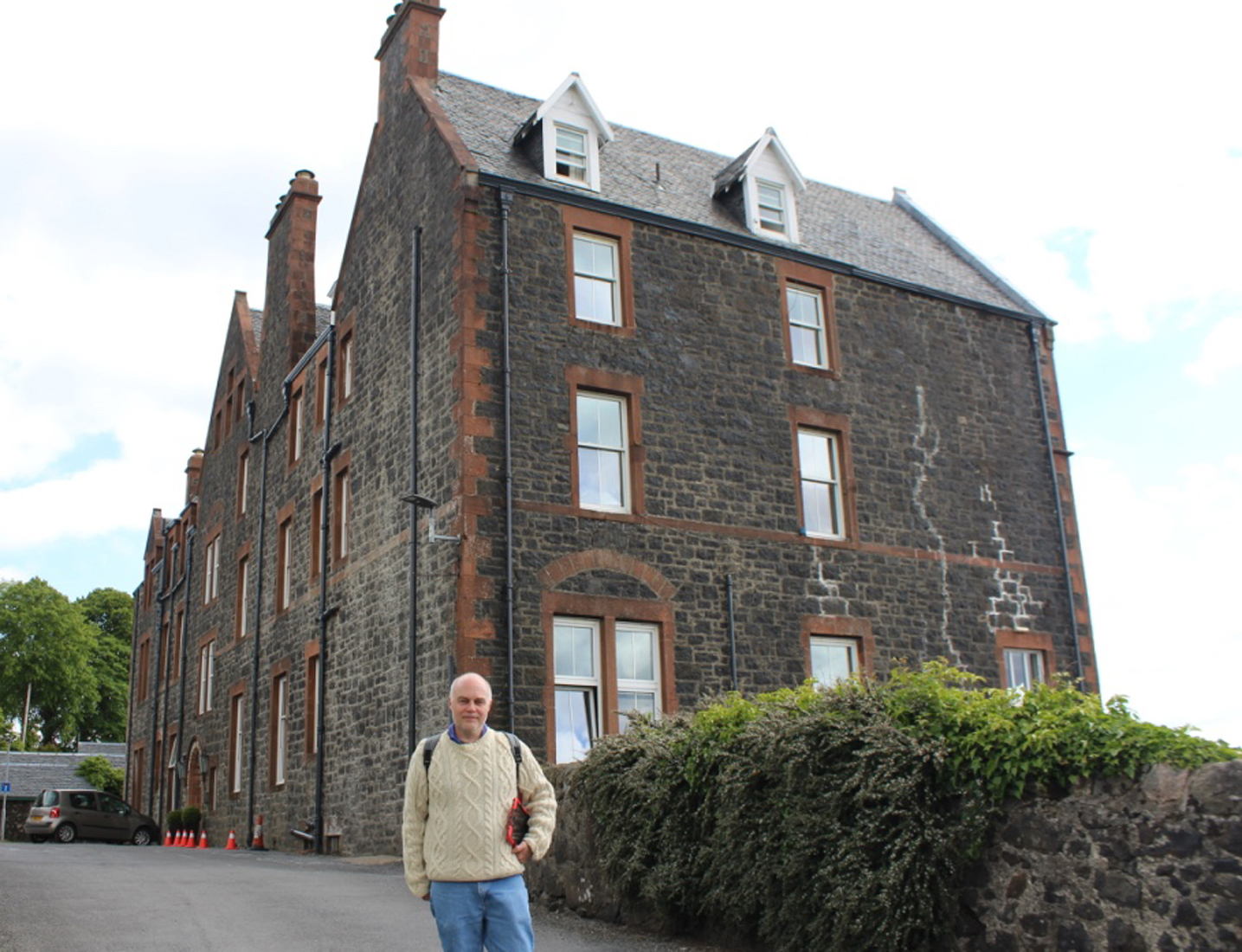
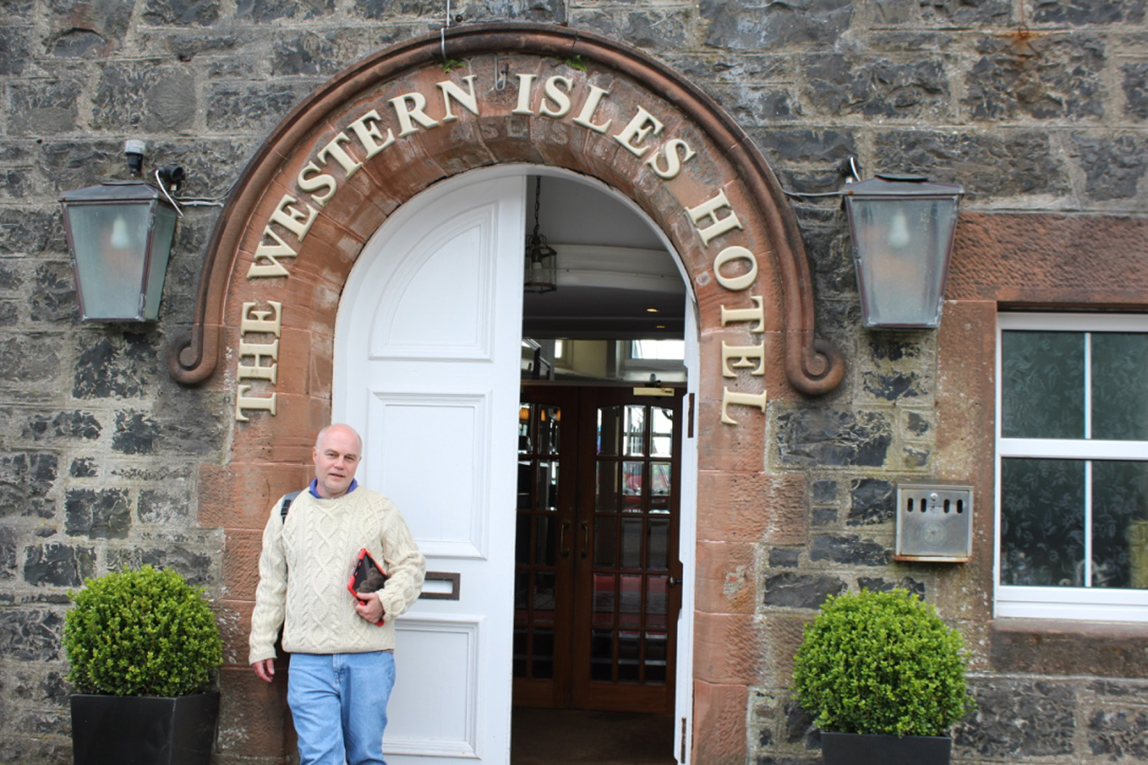
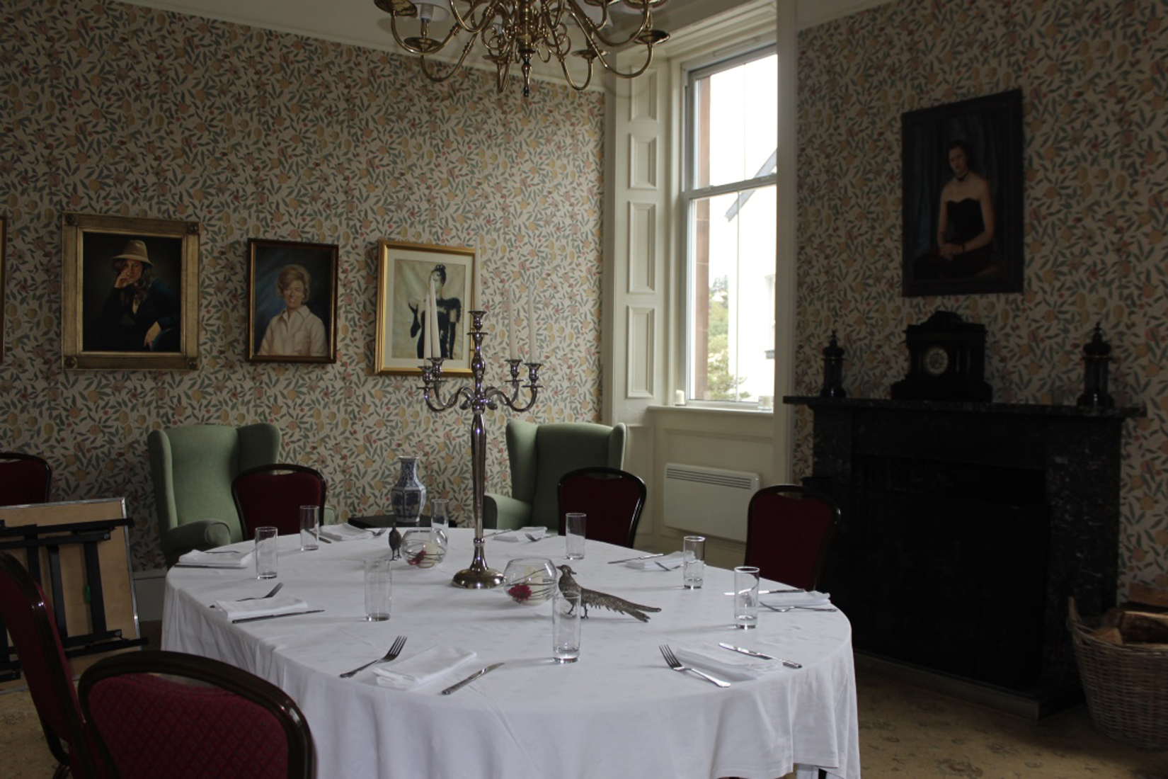
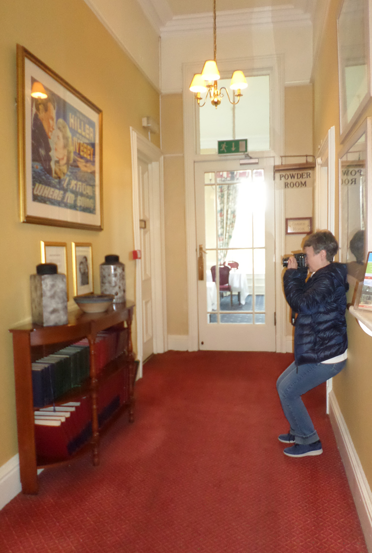
Susan and Michael Fink, the owners of Ghoirtein in Drumnadrochit, revealed themselves not only to be very good hosts, but also the former owners of The Western Isles Hotel, where scenes from “I Know Where I’m Going” had been filmed.
Click on the image to advance the slideshow.

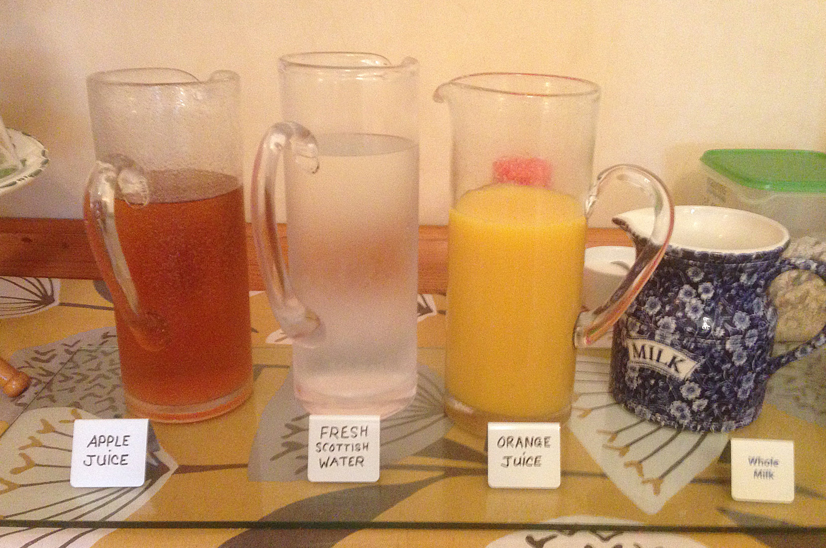
Number 10 in Stirling, was an immaculate B&B owned by Donald and Carol Cameron. Donald was a treasure trove of Scottish history and was especially pleased that I chose to have some haggis with my final “Full Scottish” Breakfast.
Click on the image to advance the slideshow.

With every adventure, there is an excitement about visiting a new place and casting away one’s day-to-day cares in life. For a brief time you can forget the things you are unhappy about and experience a place outside of your own world.

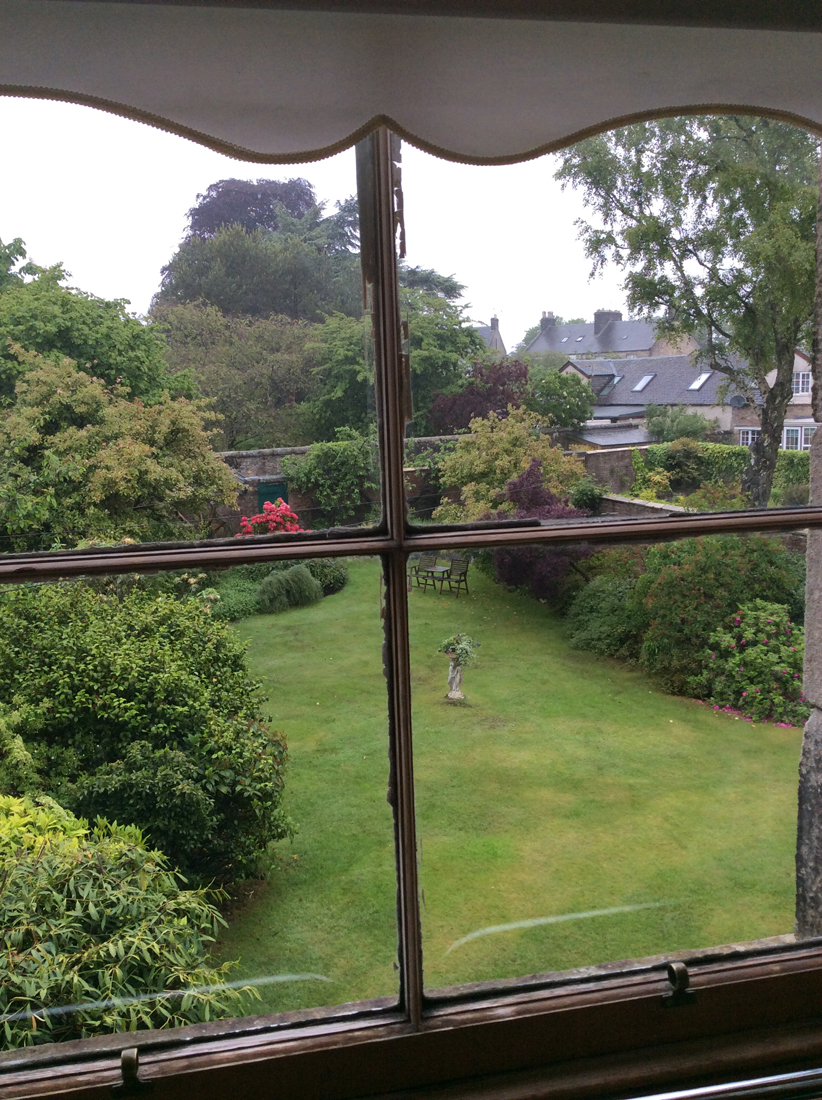
I think it’s probably the same reason we go to the movies. When I returned to my little apartment, it was exactly as I had left it.  After a missed train and a delayed arrival, I was very happy to open the windows and allow the cool evening breeze to welcome me home.  

An Artist’s Space

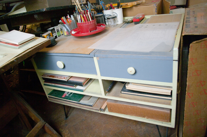
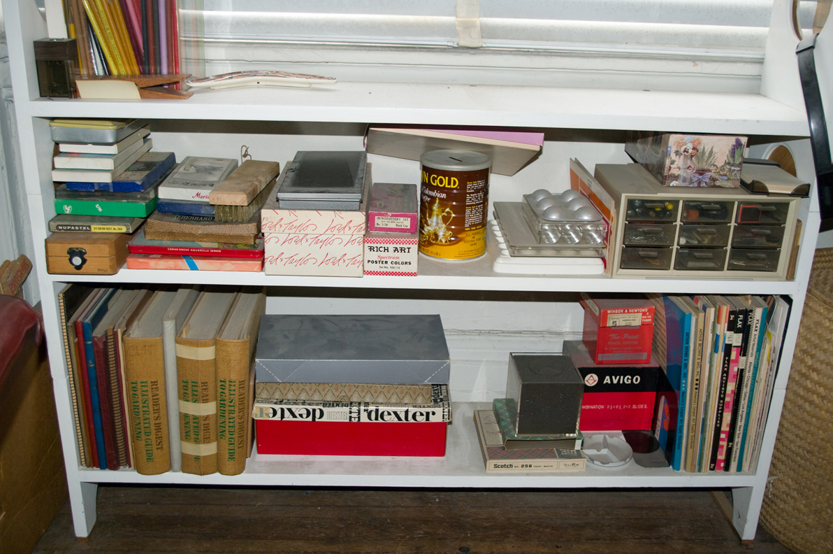
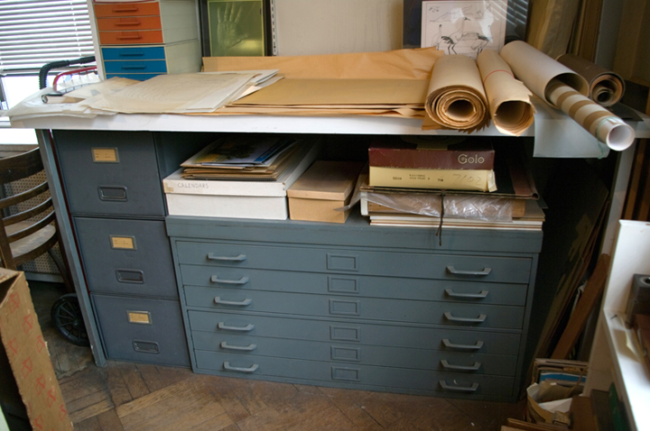
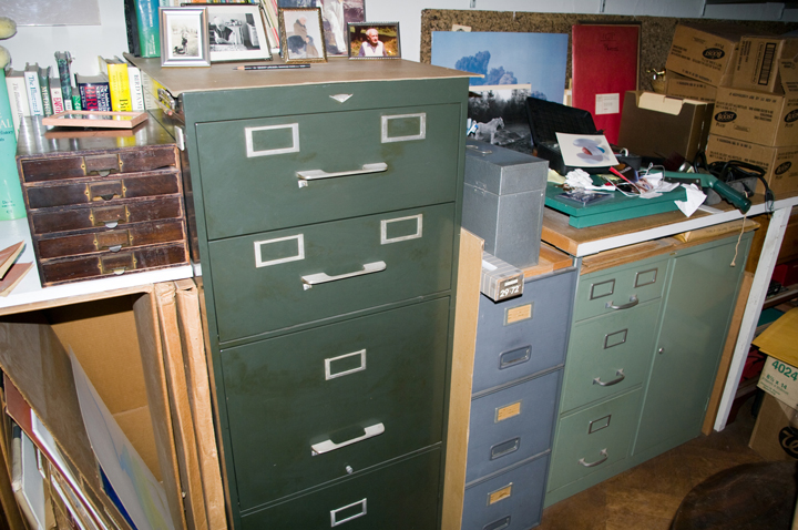
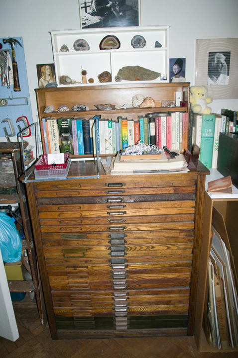
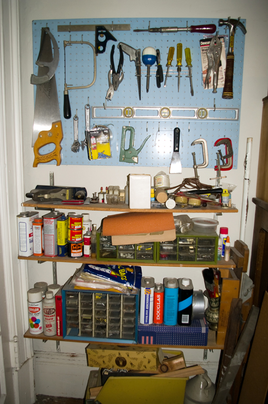
My appreciation of an artist’s creative space started at an early age. The first art studio that I ever saw was that of our family friend Enid Kotschnig. She was a professional illustrator whose scientific illustrations of animals and plants graced the covers of Smithsonian Magazine and many books and scientific publications.


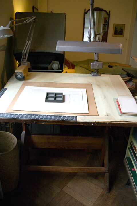
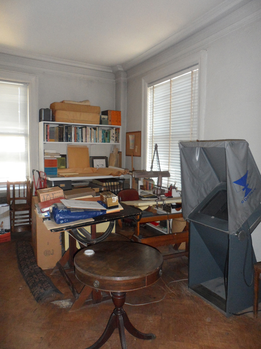
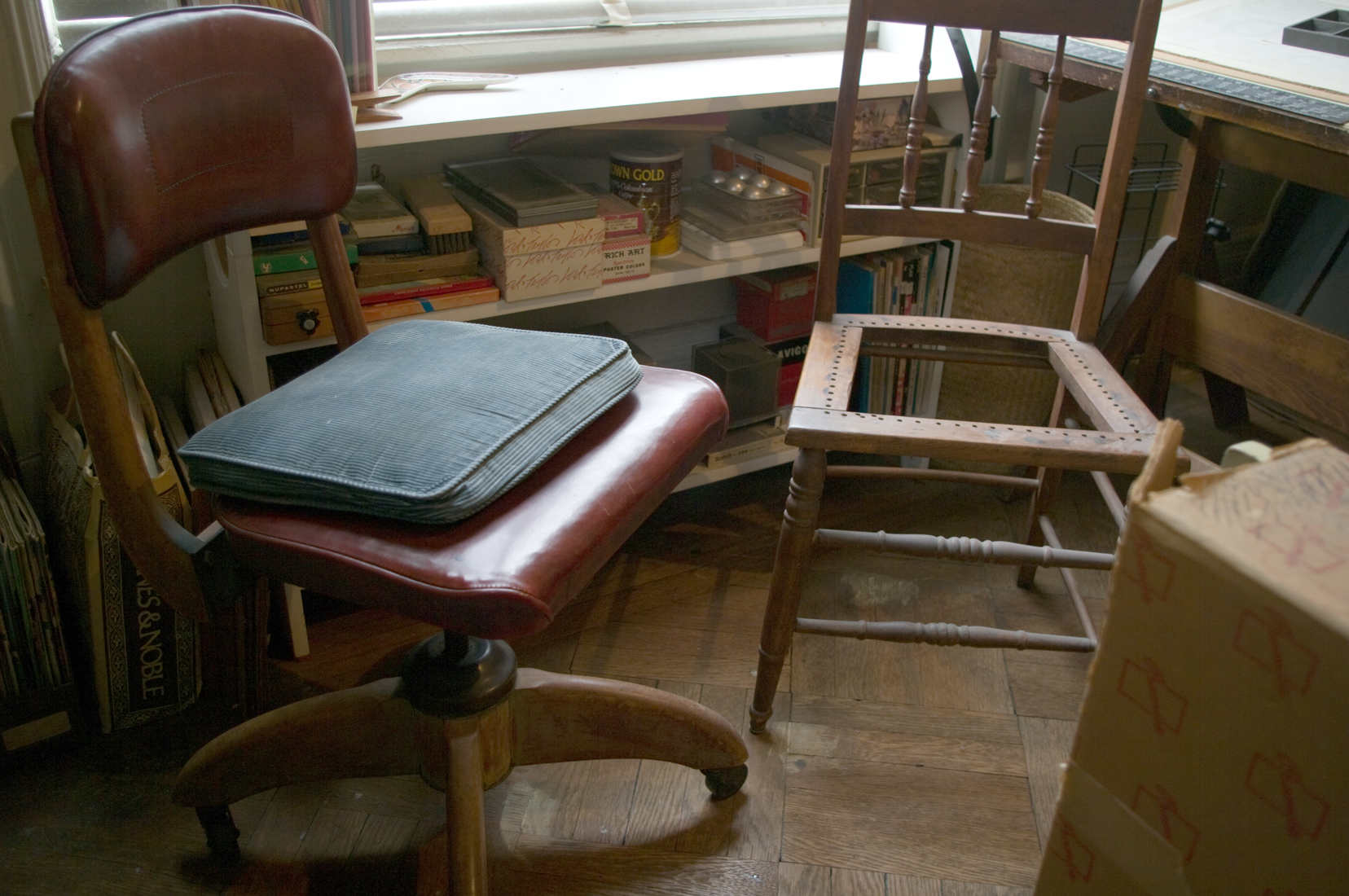
Enid’s studio was one room in her New York City apartment, but it was a place of refuge for her from the outside world. Meticulously orderly, she had all her paints and brushes, illustration board and pads of paper and books organized in a way that fascinated me and my brother when were children. Enid showed us great patience and kindness, teaching us how to use her Goodkin Lucigraph enlarging machine and showing us the process she followed in making her art. These pictures of Enids’ studio were taken after she had passed away, but the memories remain. Click on the image to advance the slideshow below.

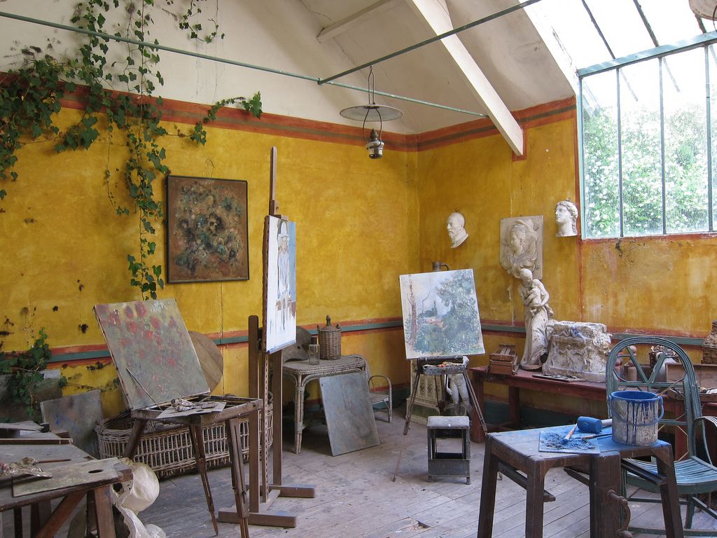
My fascination with art studios continues to this day. What does the place look like — where an artist’s creative imagination struggles or is unleashed? Does a studio echo the work of an artist? Is it a creative haven, or disorderly place of spontaneity? Here are some images of artists spaces.

 
Alexander Calder in his studio in Roxbury, CT

Alexander Calder in his studio in Roxbury, CT

Claude Monet's art Studio

Claude Monet's art Studio

N.C. Wyeth’s art studio

N.C. Wyeth’s art studio

Norman Rockwell in his studio

Norman Rockwell in his studio

Paul Cezanne’s art studio

Paul Cezanne’s art studio

Lucian Freud at work in his studio

Lucian Freud at work in his studio

Francis Bacon’s art studio

Francis Bacon’s art studio

Fairfiled Porter at work in his studio

Fairfiled Porter at work in his studio

Pablo Picasso hanging out in his studio

Pablo Picasso hanging out in his studio

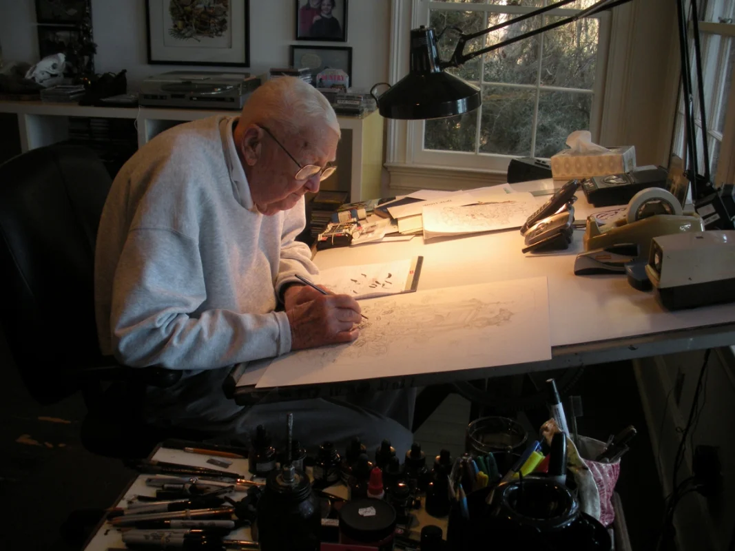
Mort Drucker's Studio

Mort Drucker's Studio

Jack Davis at work at his drawing table

Jack Davis at work at his drawing table

Will Eisner in his studio

Will Eisner in his studio

Jules Feiffer at work at his drawing table

Jules Feiffer at work at his drawing table

The drawing table which both Drew Bishop and his daughter Faith share.

The drawing table which both Drew Bishop and his daughter Faith share.

If you are curious about artist’s studios, there are many websites dedicated to sharing the creative spaces of creative people. For a start, there is a nice collection here:

https://www.boredpanda.com/famous-artists-and-their-muses-in-their-studios/?utm_source=google&utm_medium=organic&utm_campaign=organic

A Wacky Time!

It’s a mystery of the ages how Topps, Inc., the premier publisher and distributor of sports trading cards in the United States, got into the business of manufacturing stickers parodying branded consumer products. As unlikely as it was at the time, Wacky Packages became a very successful product line that surprised everyone.

Out of the turbulent 1960s, arose the great satire magazines, new comic book super heroes and music that inspired a generation. This counter-culture time embraced any ideas which talked of resistance and change. Mad Magazine, the irreverent publication created by EC Comics in the late 1950s, was at the forefront, leading the way to a new era in comic art expression. Artists emerged such as Ed “Big Daddy” Roth, who created Rat Fink and introduced everyone to his wild and wacky automotive art. Underground adult comix created by Robert Crumb, Gilbert Shelton, Barbara Mendez, Trina Robbins and others explored the exploits of a 1960s generation, that wasn’t interested in reading Superman, Captain America or Spiderman. It was a wacky time!

Underground-comics-pictures.jpg

In 1967, Topps Inc, which produced sports trading cards for baseball, football and hockey decided they needed to get into the act. Thus Wacky Packages were born. These parodies of famous brands of food, household cleaning products, personal hygiene and other commercial products became the stuff of legend. It was said, that in 1973 Wacky Packages stickers outsold Topps’ biggest selling product, baseball cards.

Wacky-Packages-Composite_1.jpg
Wacky-Packages-Composite_2.jpg
Wacky-Packages-Composite_3.jpg

Although many different cartoonists worked on the series of cards, the first series of stickers were primarily the work of Norm Saunders and Art Spiegleman. The stickers were 2.4’ x 3.5” (basically the same size as baseball cards) and were initially on a card, to be peeled off and licked like a postage stamp, so that they could be adhered.

Wacky-Packages-Composite_4.jpg

By the early 1970s, the stickers had become slightly smaller, with a peel-off adhesive, mercifully replacing the lick-and-stick postage stamp glue of the earliest series. The wacky package releases of 1973-1976 usually contained 2 stickers, a puzzle piece, checklist card and a brittle piece of gum which most kids only chew if they were desperate. This was the Wacky Packages era that I fondly remember trading with my classmates, in an unspoken race to see who could complete the collection for that particular year.

Wacky-Packages-Composite_5.jpg
Wacky-Packages-Composite_6.jpg

Many fine illustrators and cartoonists contributed to the series of cards over the years, including: Norm Saunders, Art Spiegelman, Wally Wood, Kim DeitchGeorge EvansDrew FriedmanBill GriffithJay Lynch, Bhob Stewart, Tom Sutton, and even Robert Grossman. But the initial series of stickers were primarily the creative work of Norm Saunders and Art Spiegelman.

Norman Saunders was a prolific illustrator who made a good living painting cover art for pulp fiction magazines, paperbacks, and comic books. He made pocket change working for Topps repainting the uniforms for baseball players who were traded, so that an expensive photo shoot could be avaoided. In the early 1960s he worked on the notorious Mars Attacks collection of trading cards with the EC comic artist Wally Wood. For the time, they were as violent and explosive as the EC comic books which inspired them. EC comic artist Wally Wood also did rough out drawings for some of the first series of Wacky Packages, which Saunders would then paint.

Norm-Saunders-Composite-2.jpg

Art Spiegelman worked for Topps for around 20 years as a staff artist and cartoonist. He was part of the creative team that produced Wacky Packages and Garbage Pail Kids. Spiegelman’s greatest personal achievement was in the writing and illustration of Maus, a graphic novel which won him a Pulitzer Prize in 1992. In it he memorably depicted Germans as cats, Jews as mice, and the Polish as pigs. Spiegelman continues his work as a cartoonist and teaches at The School of Visual Arts, in New York City.

Art-Spiegelman-Composite.jpg